Cognitive Boundaries of Neighborhoods
This is a test article! I am still working on the longer, more serious version that walks through everything from scraping the data to the regressions and the very anticlimactic results.
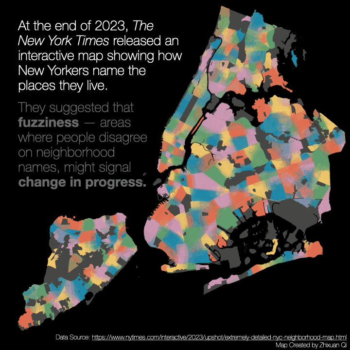
A visualization of neighborhood fuzziness, highlighting blocks where residents diverge most in how they define place.
This project started during my independent study at Cornell Tech with Prof. Garg and my research buddy Shreya, who is also one of my best friends on Roosevelt Island. It was the spring of 2024 and The New York Times had just dropped their extremely detailed neighborhood survey map. The map was gorgeous and oddly dramatic. The article that came with it claimed that the fuzziness of a neighborhood boundary might signal gentrification. A very big idea delivered in a very calm NYT voice.
Shreya and I took it way too seriously and spent an entire semester trying to see if this was true. We ran regressions, tried different entropy metrics, and waited for some magical statistical revelation to appear. It did not. We found absolutely nothing. Not even a tiny suggestion. Just silence from the universe.
In hindsight this makes a lot of sense. Gentrification is massive and messy. Demographics explain something. Social change explains something. The built environment and mobility patterns also warp how people imagine where one neighborhood ends and another begins. Perception is complicated. Boundaries are complicated. Trying to model a collective feeling is very ambitious but also very fun.
I still think about this project a lot. It hits a nerve for me. There is something delightful about trying to quantify a very human, very fuzzy mental map.
For this year’s 30 Day Mapping Challenge I resurrected the idea and made a tiny narrative version for the prompt Polygon as a participants of the Urban Data working group at EAMMO.